The Nested Corner Case
The components betrayed me?
• • •
Picture this: you’re tasked with designing a new card component for your app, so you reach for your trusty library and start assembling. You grab a surface here, an image container there, some heading text, perhaps a description, a button, and voila! It looks…funny?
You’ve done everything right, your spacing is good, and the information architecture is spot on, but those corners… what is up with that bulge over there? Well, it looks like you’ve painted yourself into a nested corner situation: Putting things with rounded corners inside other things with rounded corners.
Let’s take a look at this *cough* hypothetical *cough* scenario: The card itself and the image container both share the same border radius (thanks component library). If we finish drawing the circles based on those radii, we find that they are not concentric with each other. That results in the card feeling weirdly misshapen at the corners.
Misshapen corners due to using the same border radius
Extending the circles from the corners show they are not concentric
Make it go away!
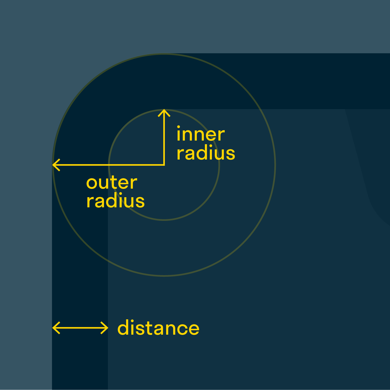
If you’re like me and get spooked by non-concentric corners then you’ll be happy to know that there is an easy fix. Do you know the border radius of the card? Yes, you do! We’ll call that the “outer radius”. We’re trying to calculate the “inner radius“, or the border radius of any element placed inside the card. To get the desired effect, its center should be located at the same point as the center of the outer radius; for that, we just need to subtract the distance from the edge.
The inner border radius is just the outer border radius minus the distance from the edge
It’s literally that simple, who knew…
Armed with this knowledge, let’s get back to our card design and see how we can fix it:
The distance is consistent now.
The circles drawn from the radius of the corners are concentric and it brings me great joy.
Thank you?
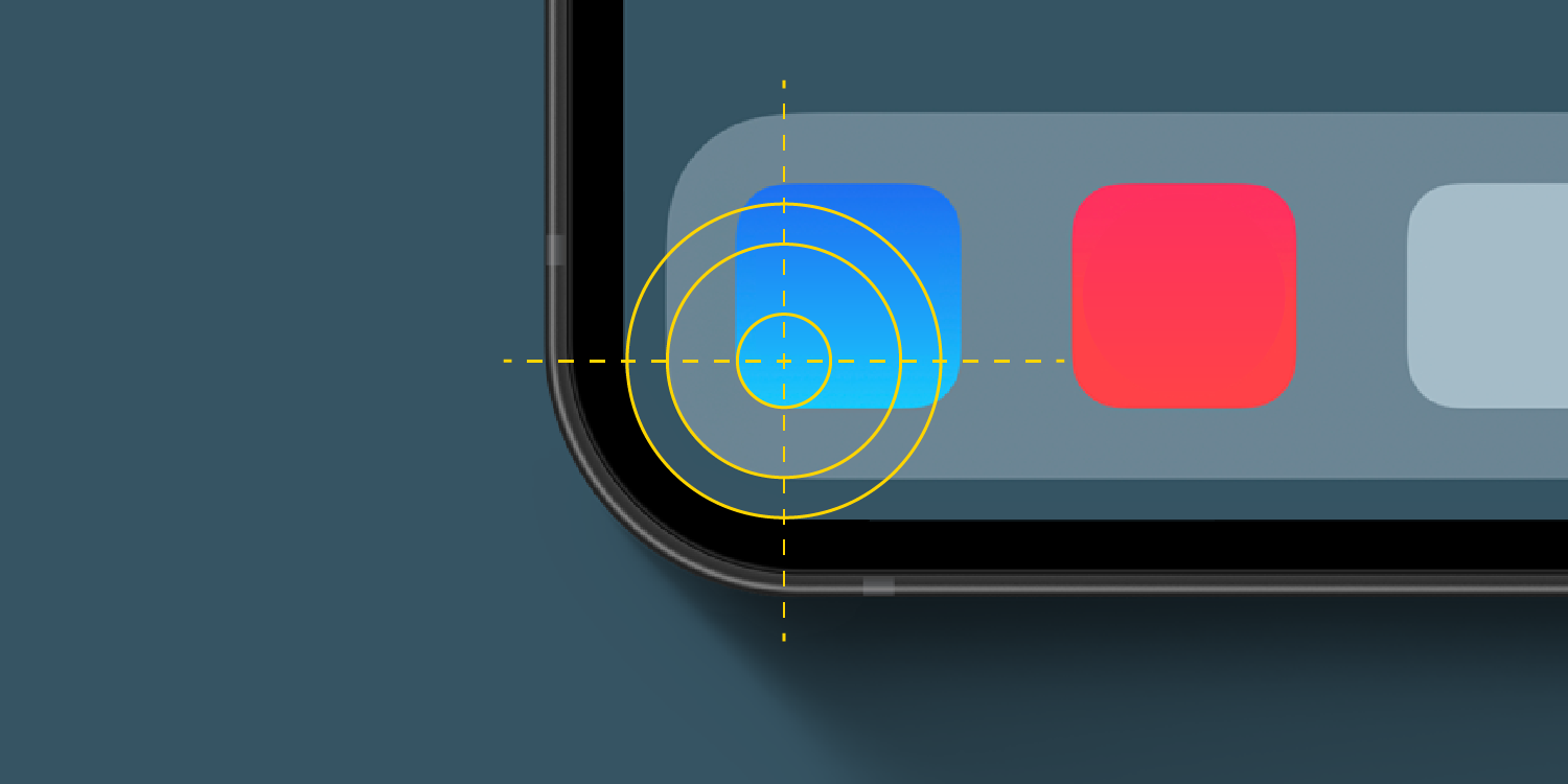
You’re welcome! Now before you go on, let me offer you some examples of nested corners you may find on your daily life courtesy of my fellow geometry geeks at apple.
Nicely concentric!
These corners are nested all the way to the device itself… These people really love order.
As you can see, the humble nested corner makes appearances just about anywhere, buttons, cards, notifications banners, icons, etc. So next time you’re putting things in things remember that you too can do some math to make it look good.


